I’ve just got back from my Day 10 run of Run Until You Drop (so, 10 miles), and uploaded my magic numbers to Garmin Connect. I was tinkering around with some of the menus and came across these two charts which I thought showed the effect of my aerobic training so far:
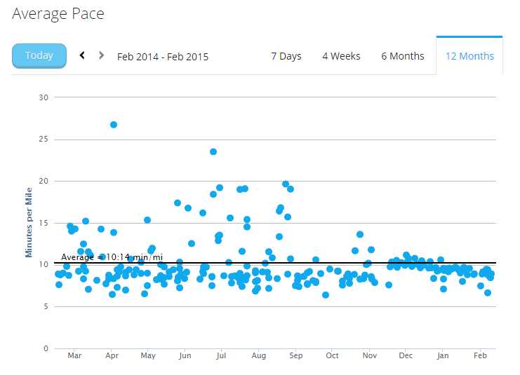
Here’s the pace:

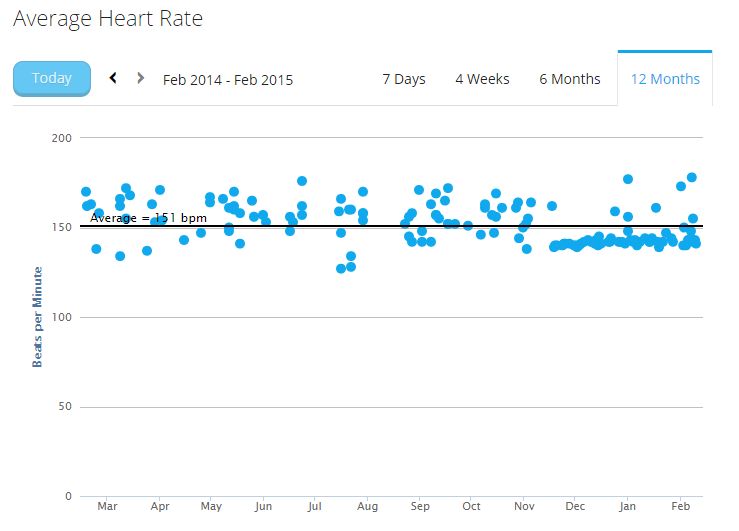
And here’s the heart rate:

I started aerobic training in mid November, so you can see the bulk of my runs have been at a heart rate around 140bpm since then (whereas before, where I wore a heart rate monitor, the average seems to be around the 160bpm mark).
And the pace in mid-November started around 10min/mile (or slightly slower), and is now around the 8:30min/mile mark with a fairly linear progression. If it keeps going like that, I might be running 7 minute miles at 140bpm by June! (yeah, likely!!)
Nothing else to add really – I just thought these were quite a clear and interesting graphical representation of how my training has changed and the benefits it’s bringing.

